Over the past years however, this principle has been most definitely forced into my conscious, once I began studying at university. Whilst studying the BSc Product Design course, the classes taught have definitely helped me gain the knowledge needed to analyse the viability of a product, and to take more care into making sure it would be functional. This has helped my design process, as I am now much more conscious of the different stages between a conceptual idea or notion, to a working prototype.
Whilst reviewing the principle that is ‘Form Follows Function’, I must say I disagree with the word follows in the respect that this is only viable some of the time. The term, coined by Louis Sullivan, was corrected by Frank Lloyd Wright later on, who said “Form and function should be one, joined in a spiritual union”. This is the view I will address; one in which form and function should themselves be equal.
It has to be said however that although I work with this balance in mind, I also believe that an unbiased, equilibrium between form and function is theoretical, and can never be successfully achieved; I believe it is an ideal held by some designers that can never be fully applied, but only emulated to the best of the designer’s ability.
This is due to two reasons; firstly, the designer must overall, consciously or subconsciously, decide on what is more important, the aesthetics or the functionality of the product. There will always be a case of the designer having to sacrifice one for the other, for if this did not occur, then the perfect product will have been designed.
This brings me to my second reason, perfection and imperfection in terms of form and functionality, are relative to the criticism of the user. Harshly or not, there will always be some part of a product to which the critics will ‘nitpick’ and find fault.
The perfect form can be deliberated endlessly, with no definitive conclusion brought to light, as it is all based on the opinion of the user. This can also be said for functionality, albeit less so, as the form of a product provokes more emotion than that of its functionality.
Also, one of the main things to bear in mind about this principle is how the form can affect the function and vice versa. There are times when one will be the cause for the other. For example, Raymond Loewy’s “streamline style” shows perfectly how aesthetical improvements brought about functional ones. The ‘sheathing’ of mechanical appliances such as his commission for Gestetner to modernise the duplicating machine showed this, as a cover over the mechanical components of the machine not only looked aesthetically pleasing (especially in the industrialised, ‘bare cogs’ 1920’s US), but also had a practicality to shield the components from dust an dirt, and shield the user from excess oils and inks.
This is important to bear in mind when considering the form follows function principle, as the two can crossover, to work in tandem or even to conflict each other, as the form of a product can vastly hinder its practicality. This could be a physical or mental issue for the user. The form of a product can affect the product for worse structurally, meaning the aesthetics of the design could mean the product is more prone to physical failure. For instance the first commercial airliner, the De Havilland Comet, had square windows, which later proved to be structurally unsound due to metal fatigue failure, resulting in the change to oval windows used in aircraft today.
The form of the product could also have a negative impact on its function in a psychological manner; confusing layouts due to the poor mapping of the components on a product can impede the usability. In the same way, a form which is radically different to its predecessors can have a negative impact on the users understanding of the product. For instance the standard computer keyboard (the “QWERTY” keyboard) has been taken from its original context of the typewriter as a form of evolution in terms of typing appliance. The original typewriter keyboard layout was so, to stop the letter keys that would most likely follow one another from jamming when pressed in quick succession. Obviously this is not a problem with computers, and even though there are more efficient layouts for a keyboard (notably the ‘Dvorak’ keyboard layout used for professional fast typists), they have never been widely accepted, due to the general consumer public’s resistance to change.
As discussed in my critical essay, modern technological advancement has played a big part in how this principle is perceived. As electronic equipment becomes smaller and the consumer market gets bigger, more effort is being focused on the aesthetics of the product and not just its new features. This shows that form and function must be both considered by the designer, as technology that was once confined to the office or business is now available to everyone and to be used everywhere. The computer for example was once a cumbersome piece of equipment only used in large businesses, however now, with the rapid progression of technology, laptop computers can be used in any room of the user’s house, with limited restrictions. This has led to the acknowledgment of aesthetics in computer design, for example, the highly popular ‘Mac book’ laptop computer by Apple comes as standard in a solid white colour, meaning that it can be used in any room, and not look out of place.

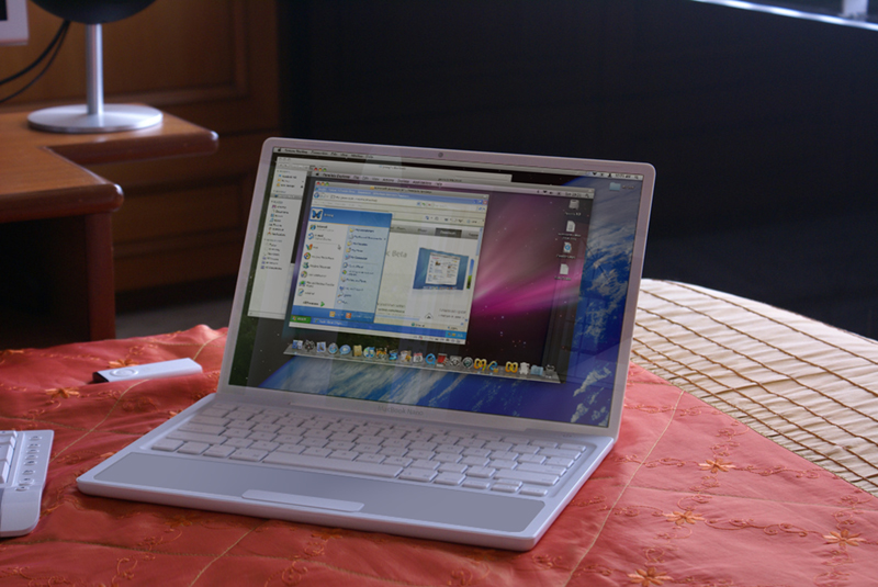
Again, the laptop computer can be used as an example of how the layout and visual form has improved the functionality for the user. Despite having a far superior range of commands and programs than that of the early computers, the layout and mapping of these tool on the laptop computer’s interface has meant that compared to the early computer, the laptop is, in effect, easier to use. Older computers required complex coding to be typed in by the user, whereas now, the use of simple iconography is used to signify with the user, the nature of the tool or the program.
In my opinion however, the main aspect of this principle is that a product that relies heavily on form can be admired, yet a product that relies heavily on function is usually due to necessity, which I think raises an interesting point for me as a designer; how much is the product I am designing going to be used?
If a product is to be used frequently, it stands to reason that is should be practical first, and visually pleasing second, however if the product has a more ornamental feature, then aesthetics should be key.
As well as frequency of use, this should also be applied to the number of people using the product. The greater number and variety of people using the product, the greater care should be taken to make the design as functional, and as easy to use as possible.
No comments:
Post a Comment